On a crusade against boring presentations
September 22, 2007

Have you ever been to a presentation that was so boring, you could barely keep your eyes open? It seems like presentations are getting more and more common these days and too often they’re presentations you’re expected to attend. Too bad that more presentations also means more
Boring Presentations
Today I want to look at things that boring presentations have in common. And above all: how you can prevent giving a boring presentation yourself.
Change the world
Every presentation is a chance to change the world. Well maybe not the world, but the people in the audience. Choose a topic that you care about. If you don’t think the topic is important - why should the audience care? Sometimes you’ll be “forced” to present a topic you don’t care about. Remember that you are given an opportunity to change the world. Find something in that topic you care about - or be doomed to hold a boring presentation.Your enthusiasm for the topic is most important. Of course you need to research the topic well and yes, sexy slides can help make the message stick. But nothing beats enthusiasm.
Avoid Bulletpoints
If you look at the slides of boring presentations, you often find massive amounts of bullet points. Look at Aaron Swartz’s PowerPoint Remix for reasons why bullet points aren’t good (written as bullet points no less).
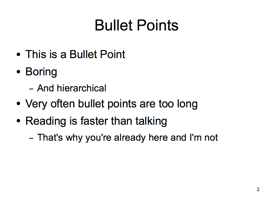
I don’t like them because most people in the audience can read faster than the speaker can talk. The time the speaker spends to catch up to where the reader is, is - well - boring. I also think they are totally uncreative.
Slides <> Script
Sometimes I get the feeling that the speaker needs the slides more then the audience. Who’d miss them more if you took them away? For some speakers the slides are the script - the tool to make sure they don’t forget to tell something. Everybody knows that you shouldn’t read from a paper. Why is reading from a screen different?
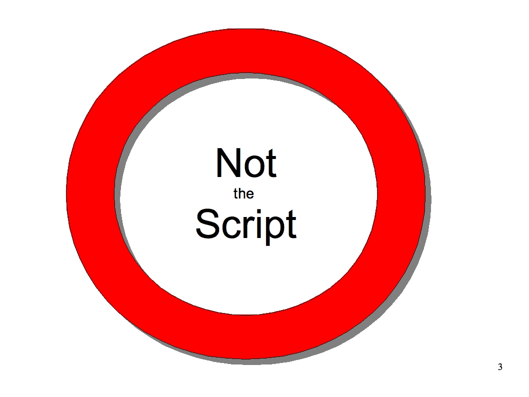
The slide show is not the script. Write a real script. Then practice. Until you know what you want to say - and when.
Slides <> Handout
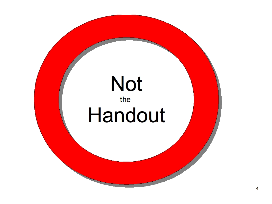
The slide show is not a hand out. The slide show is for the people that are sitting in the audience. If you plan to use it as both: the handout and the medium to support your words, it’ll end up doing neither. As a handout it won’t have enough information and as a slide show it will be boring.
So, what is the slide show if it isn’t the script and the handout? It’s a tool to help make a message stick. Your job as a speaker is to figure out how they may achieve that. Pictures are a good starting point.
Use Corporate Design Template to stifle creativity
Corporate Design and templates = boring. They force you to use certain colors, certain fonts and sizes. Logos and pictures reduce available space. I’m totally OK that the company paying for the presentation gets its share of publicity - but templates just aren’t a good way.
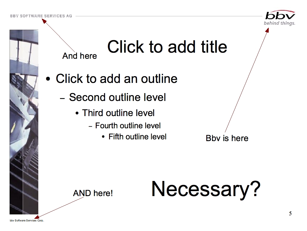
Templates (the branded versions in particular) add too much visual clutter. How many times does the name of the company have to be on one slide? The creation time is only interesting if it shows that the speaker probably didn’t spend a lot of time preparing. And the only thing that “page 10 of 93″ indicates is how much longer the audience has to suffer.
Ask yourself: What does this slide have to communicate. Remove every element that doesn’t support that.
Corporate Designed Templates exist to restrict creativity and to save time (and to save the world from the occassional speaker with bad color taste).
The message a template sends to the speaker is: “You don’t need to worry about the slide show. Concentrate on the content.” Sure the content is very important. But if the content doesn’t make it into the audiences head because the presentation was boring then that’s sad. And a waste.
No Complex Diagrams on Slides
Complex architectures don’t belong on a slide. Neither do class diagrams. Or anything else with a lot of rectangles, lines and small text. Most of the time some people won’t be able to read the words, because they are too small. And it doesn’t help, if you read all words out loud, because keeping it all in the head is just too much to ask, some won’t even try. Very often those diagrams are too exhaustive. Above all, don’t use symbols that aren’t clear to everybody. Explaining symbols (that might not even be important for the point you’re trying to make) is boring for everyone who already knows the symbol.
If you need a diagram anyway, it might be a good idea to draw it live, for example on a flip chart. For a lot of diagrams there is meaning in the sequence the symbols are drawn. In a class diagram, you don’t start with the least important class in the system. If you explain the meaning of a symbol while drawing, that’s less boring because it doesn’t slow the presentation down (talking is faster than drawing). You also will not run into the problem of being too exhaustive.
The Speaker - not the slides - is the most important part of the show
Let’s say the slide show is perfect - exciting and visually pleasing. Not flashy, but fitting the words of the speaker nicely.
The presentation can still be boring - because the speaker is the most important part of the presentation. He may talk monotonously, or too quietly, sentences that are too long etc. However, presentation technique is usually not a problem, if he’s talking about a topic he cares about. Enthusiasm just doesn’t go with talking monotonously.
Long sentences are a problem: people in the audiance can’t go back and hear the beginning of the sentence again. In other words: long sentences need a lot of concentration from your audience. Not everybody is willing (or able) to concentrate over a long period of time (like say 30 min). Some will loose their concentration and inevitably get bored.
Explain Technical Terms - Maybe even twice
If you’re holding a technical talk, make sure you cut down on your use of technical terms. If you can’t avoid them make sure to explain them if necessary (you don’t need to explain what HTML is to a web developer, but you have to explain it when you talk to a group carpenters). If you use the same term again later (after not using it for a few minutes) - you might have to remind the audience of what that meant.
Mask of Complexity - to hide absence of ideas

Technical terms are often used as a mask. As a mask to hide the absence of ideas. If you fear that somebody finds out that your presentation has little content, you can always hide that fact behind the “mask of complexity”. Make everything appear complicated, use a lot of technical terms. If somebody dares to ask a question, throw more complexity and other terms at them. People will be in awe of your intelligence. And bored.
If you really understand what you’re talking about, you will be able to make things simple enough for everybody to understand.
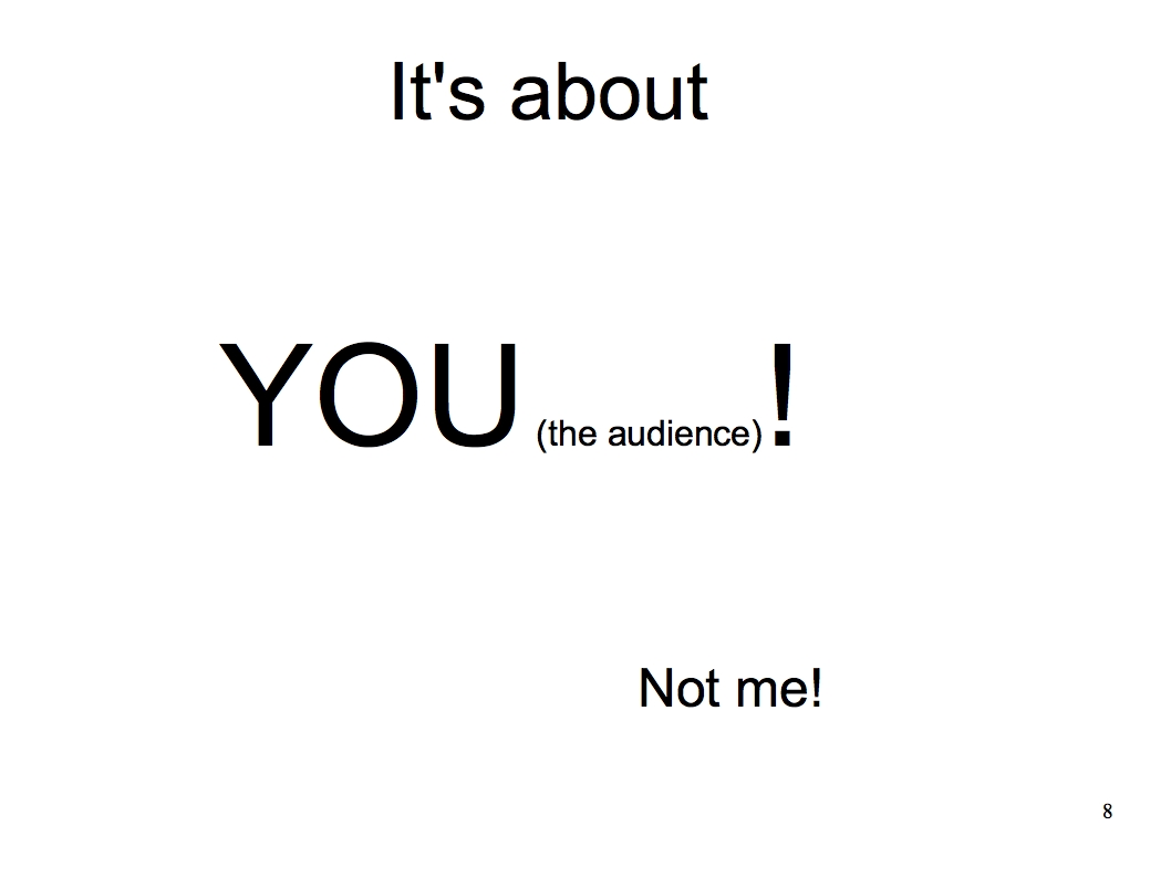
It’s about the audience
One last point: If you give a presentation, it isn’t about you. It’s about the audience. It isn’t about making yourself look good. It isn’t to prove you’re the guru and the others are not. Think about what the audience is interested in. How you can help them solve a problem they have. Make it be valuable for them.
And one more thing: if you don’t have anything more to say - stop your presentation even if you have time left.
Do you know any other things that boring presentations have in common? And what techniques do you use to spice up your presentations?
Auf Deutsch: Auf dem Kreuzzug gegen langweilige Präsentationen
I agree with some of the mentioned topics. Let me do a single comment to “Slides Script”. I hate presentations, when the speaker doesn’t care about what’s on the actual shown slide and just speaks about something in a “far” context. Schwupp, the slide has gone and the speaker didn’t even think about to explain, what on the slide was showed. Even, when there were bullet points
St.Venceslav enjoyed no crusade in his life
Hi.
I’m a presentation skills trainer and I’d like you to take this damned page down, please….! You’re doing me out of business!
Great stuff.
Simon
I present a lot. A useful discipline is sometimes to dispense with slides altogether and simply use a flipchart - or nothing. Makes for a more intimate presentation.
Then when you come back to using slides, you can focus on what they are really adding - and if that’s worth the loss of intimacy. If not, ditch them.